Master Price Volume Charts: A Trader's Guide to Confirmation & Reversals
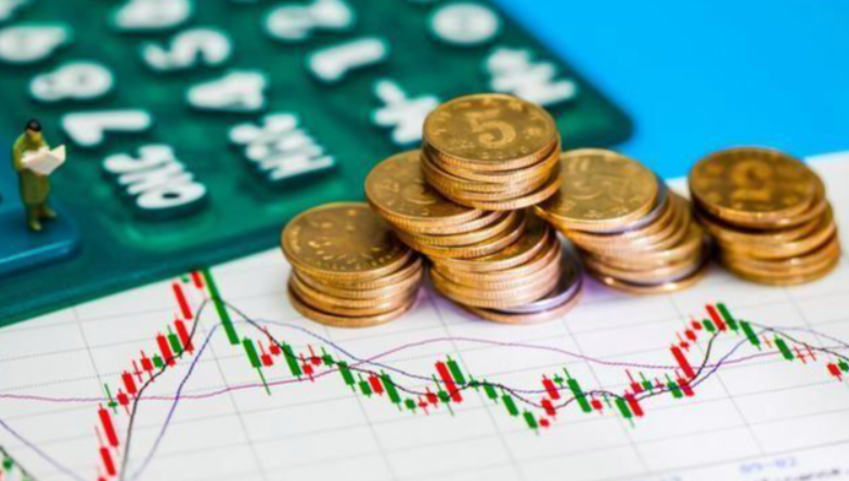
Let's cut to the chase. You can stare at candlestick patterns and moving averages all day, but if you're ignoring the price volume relationship chart, you're trading half-blind. Price tells you what is happening. Volume tells you how much conviction is behind the move. It's the difference between a genuine breakout and a headfake that'll wipe out your stop-loss. I learned this the hard way early on, watching a "perfect" bullish flag pattern collapse on me because the volume on the breakout was pathetic—a classic trap I now avoid.
What’s Inside This Guide?
What is a Price Volume Relationship Chart?
It's not a single magical indicator. It's the practice of analyzing a security's trading volume in context with its price action. Typically, you'll see a standard price chart (like candlesticks or bars) on the top panel, with a volume histogram (those vertical bars) plotted directly below on a shared time axis. This setup lets you see instantly if a price move is backed by strong participation or if it's just noise.
The core principle is simple: volume confirms trend. In a healthy uptrend, you want to see volume expand on up days and contract on pullbacks. The opposite is true for downtrends. When this relationship breaks down—like price making a new high on shrinking volume—it's a warning sign called divergence. This is where most beginners miss the signal. They see the new high and get excited, while the volume is quietly whispering, "Not so fast."
A Non-Consensus Viewpoint: Most tutorials treat low volume as universally bad. That's not always true. Exceptionally low volume after a prolonged, emotional sell-off can signal selling exhaustion. The sellers are gone, and the stock is just drifting. It's not a buy signal by itself, but it's a necessary precondition for a basing pattern to form. Ignoring this nuance can make you miss the very early setup for a reversal.
How to Read a Price Volume Relationship Chart?
Forget memorizing a hundred rules. Focus on these four core relationships. I keep this table mentally bookmarked every time I analyze a chart.
| Price Action | Volume Action | Typical Interpretation (Market Psychology) | Strength/Weakness Signal |
|---|---|---|---|
| Rising | Above Average / Rising | Strong buying interest. New buyers are aggressively entering, pushing price higher against selling pressure. This is confirmation. | Strong Bullish. The trend is likely to continue. |
| Rising | Below Average / Falling | Lack of conviction. The move higher is not attracting broad participation. Could be short-covering or low-liquidity drift. This is a divergence. | Weak Bullish (Caution). A potential reversal or pause is ahead. |
| Falling | Above Average / Rising | Strong selling pressure. Sellers are in control and willing to hit the bid, overwhelming buyers. | Strong Bearish. The downtrend is accelerating. |
| Falling | Below Average / Falling | Lack of aggressive selling. The decline may be losing steam, or it's happening in a vacuum with few participants. | Weak Bearish (Watch). Could indicate selling exhaustion, setting up for a bounce or basing. |
The key is comparing volume to its recent average, not some absolute number. Most charting platforms show a moving average line (like a 20-period) over the volume bars. Use that as your baseline.
Where New Traders Get Tripped Up
They look at a single big green volume bar and think "bullish!" But you must ask: Where did the price close relative to its range? A huge volume bar with the price closing in the middle or lower half of the day's range (a long upper wick) suggests all that buying effort was met with even stronger selling. That's actually distribution, not accumulation. Always marry the volume reading to the price bar's structure.
What Are the Most Common Price Volume Patterns?
These are the recurring stories volume tells on a chart.
1. The Breakout Confirmation: This is the bread and butter. A stock consolidates in a tight range (like a triangle or rectangle) on declining volume. Then, it bursts above resistance. For it to be valid, the breakout candle must be accompanied by volume significantly higher than the recent average. If volume is meek, it's suspect. I've seen more failed breakouts on low volume than I can count.
2. The Volume Climax (or Selling Exhaustion): After a steep, emotional decline, the stock gaps down again on absolutely massive volume—often the highest in months. This is panic. But frequently, the price doesn't close at the absolute low of the day. This spike can mark a capitulation bottom. The key follow-up? You need to see volume dry up dramatically on any subsequent test of that low. No follow-through selling.
3. The Churn (or Distribution Top): Price grinds higher in a choppy, sluggish manner. Each little up move happens on average or low volume, but every sharp intraday sell-off comes with a noticeable volume spike. This is stealthy selling by larger players into retail buying enthusiasm. It creates a "heavy" look on the chart. When the final breakdown comes, volume finally expands, confirming the distribution.
Resources like Investopedia offer great foundational definitions of these terms, but they rarely connect them to the real-time, messy price action you actually see.
Advanced Price Volume Concepts for Experienced Traders
Once you're comfortable with the basics, these layers add depth.
Volume-Weighted Average Price (VWAP): This is a beast of a tool, especially for intraday traders. VWAP calculates the average price a stock has traded at throughout the day, weighted by volume. Trading above VWAP suggests bullish intraday bias; below it suggests bearish. Large institutions often use VWAP as a benchmark for execution. A breakout on high volume that also reclaims VWAP is a much stronger signal than one that doesn't. The CME Group's educational resources often discuss how professional desks use similar volume-weighted concepts for order execution.
Volume Profile: Instead of looking at volume per time period, it shows you at which price levels the most trading occurred. You'll see high-volume nodes (Value Areas) and low-volume gaps. Breakouts from a low-volume zone into a high-volume node often accelerate. Reversals frequently occur at the edges of old high-volume areas.
On-Balance Volume (OBV) & Money Flow Index (MFI): These are derived indicators that attempt to quantify buying and selling pressure. OBV simply adds volume on up days and subtracts on down days, creating a line. I find it most useful for spotting divergences over long periods. MFI is like an RSI that incorporates volume. My take? Use them as secondary confirmations, not primary signals. They can lag and give false readings in sideways markets.
Putting It All Together: A Real-World Trading Scenario
Let's walk through a hypothetical but common setup for stock "XYZ Tech."
The Setup: XYZ had a rough earnings drop, falling from $50 to $35 over three weeks on heavy volume. It's now been bouncing between $36 and $39 for two weeks.
Week 1-2 (The Base): Price action is tight, range-bound. Critically, volume is drying up. The down days within the range have slightly higher volume than the up days, but overall, the volume bars are shrinking toward their 20-day average. This is the exhaustion/selling absorption phase.
The Signal Day: XYZ pushes to $39.20 in the first hour. You check volume—it's already at 150% of the daily average for that time. This gets your attention. The price pulls back to $38.50 by midday, but the volume during that pullback is minimal.
The Breakout: In the last 90 minutes, buying resumes. The stock climbs past $39.50 (the prior range high). The 5-minute candles are solid, closing near their highs. Most importantly, the volume on each of these pushing candles is large and sustained. The daily volume will close at over 200% of the average.
The Decision: This is a high-probability, volume-confirmed breakout from a basing pattern. The low-volume pullback earlier in the day showed a lack of sellers. The high-volume surge shows new buyers are committed. This is where you might consider an entry, with a stop-loss just below the day's low or the base low.
Contrast this with a scenario where XYZ squeaks above $39.50 on volume that's only 80% of average. I'd ignore it. It's a trap waiting to happen.
Your Price Volume Chart FAQs Answered
Earnings gaps are volume monsters, but the follow-through is what matters. A stock gaps up 10% on huge earnings volume—that's expected. The danger is buying that gap the next day. Watch the volume on the first consolidation day after the gap. If the stock starts drifting sideways or down on volume that's still very high (near earnings-day levels), it suggests the initial buyers are already being met with equal selling pressure. That's distribution into the hype. A healthier sign is a quiet, low-volume pullback after the initial surge, indicating holders are comfortable and not rushing for the exits.
Not necessarily, and this is a subtle point. In a strong, steady uptrend within a major bull market (think Apple or Microsoft in their prime), you can see price rise on below-average volume for stretches. Why? Because the float is tightly held. Long-term investors aren't selling, so it takes less buying pressure to nudge the price up. The warning comes when the trend accelerates sharply. If you see a parabolic move on declining volume, that's a classic blow-off top warning. So, context of the overall trend phase is everything.
Absolutely, but with a major caveat. Crypto volume data is fragmented across dozens of exchanges, and some reported volume can be misleading or "wash traded." The principle still works: a Bitcoin breakout above a key resistance level is far more trustworthy if it occurs with a spike in volume on reputable exchanges (data from places like CoinMarketCap can be a start). The patterns of climax selling and accumulation work similarly. Just be extra skeptical of volume data and consider using on-chain metrics (like exchange net flows) as a complementary "volume" proxy.
Start with the standard volume histogram and its moving average. It's the raw, unfiltered data. Get proficient at reading it before adding derivatives. Once you are, I add OBV on a longer-term weekly chart to spot major divergences over quarters. MFI I use sparingly, mostly for overbought/oversold readings in ranging markets. The SEC's market structure documents emphasize the importance of actual trade volume in understanding price formation, which is what the standard histogram shows. Fancy indicators often just obscure that core relationship.
Related Articles

Leave a Comment